


Dopamine Dressing & Colour Blocking Trend Alert
- Sarah van Dort
- Feb 9
- 4 min read

What Exactly Is Dopamine Dressing?
Dopamine dressing is rooted in the idea that what we wear can have a big impact on our emotions, inspired by dopamine, one of the feel-good hormones in our brain. Essentially, it's about choosing clothing that makes you feel happy and energised.
Psychological research shows colours like yellow, pink, and orange enhance happiness. When you slip into that sunshine yellow jumper or that electric blue dress, you're not just making a style statement. You're giving yourself, and the people you encounter, an emotional lift, and honestly, who couldn't use a bit more of that at this time of year?
The beauty of dopamine dressing is that it's deeply personal. It's all about choosing clothing that lift your mood and your energy. For some women, that might mean head-to-toe hot pink. For others, it could be a single cobalt blue scarf that brightens their entire outfit. There's no right or wrong here, just what makes you feel great.
The 2025-2026 Evolution: How Dopamine Dressing Has Matured
Here's what's so exciting about where we are now: fashion is less about choosing sides and more about choosing your mood. The dopamine dressing we're seeing on the Spring/Summer 2026 runways isn't the primary colour blocking of the early 2010s. It's become so much more sophisticated and wearable.
Major designers are fully embracing this shift. Loewe's runway for Spring/Summer 2026 was a riot of colour, with lots of primaries, unlikely pairings, and bold fashion statements where colour wasn't an accent but the main event. Valentino and Versace have leaned into saturated colours, jewel tones, and electric contrasts. These aren't just hints, they're confident statements of colour as a mood enhancer.
What I love most is how accessible this has become . You don't need a designer wardrobe to embrace dopamine dressing; you just need the courage to wear what makes you smile.
The Art of Colour Blocking
Now, let's talk about colour blocking, because this is where things get really exciting. Colour-blocking proved to be a breakthrough comeback trend on the spring/summer 2026 runways. But forget everything you thought you knew about matching colours, because the rules have completely changed.
2026's approach is all about unexpected pairings, tonal variations, and strategic placement that flatter rather than overwhelm. We're seeing sage green paired with dusty rose, burnt orange meeting deep navy, and cherry red sitting alongside emerald green. These aren't the stark primary combinations you might remember; they're sophisticated and intentional.
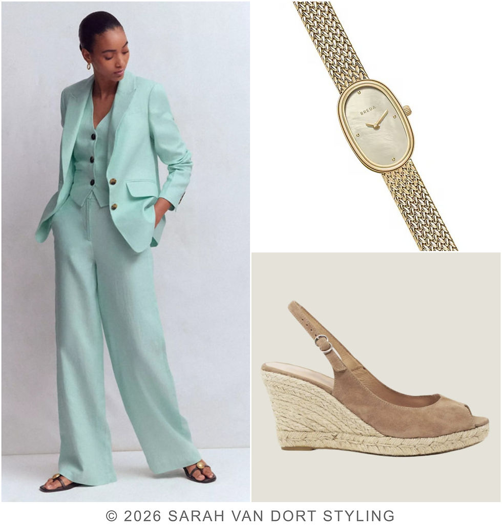
Here's what the fashion insiders are doing: Bold colour-blocking was made more wearable with neutral tones. This means you can absolutely dip your toe into this trend by pairing one bold colour with a neutral base. Think a vibrant cobalt blazer over cream trousers, or a tangerine jumper with your favourite camel coat.

The key colour pairings fashion editors are obsessing over right now include plum with cream or taupe (sophisticated and romantic), true red with buttermilk yellow (dynamic and fresh), and citron yellow with baby blue (playful yet refined). Designers paired shades that, at first glance, seem unconventional yet somehow work together effortlessly.

Texture Adds the Magic
Here's a little insider secret: texture plays a crucial role in making colour blocking feel sophisticated. When you mix a silk blouse in one shade with wool trousers in another, you create visual interest beyond just the colour contrast. This is what takes colour blocking from costume-like to chic and intentional.
Try pairing your textures thoughtfully. A velvety jumper in rich burgundy with sleek leather trousers in chocolate brown. A flowing chiffon blouse in soft peach with structured denim in cobalt. The interplay of textures makes even the boldest colour combinations feel wearable and refined.

A little Tip
Let me give you some real, wearable ideas:
For the workplace: Try colour blocking through layering rather than head to toe statements. A cobalt blue blazer over a cream top with terracotta trousers creates impact without looking costume-like. Workplace colour blocking should lean towards more muted combinations, whilst weekend looks can embrace bolder contrasts.
For everyday wear: Monochrome dressing in a bold colour is incredibly chic. Choose one vibrant shade and build your entire outfit around it. A full burgundy look with different textures (think wool trousers, silk blouse, leather boots) feels intentional and sophisticated.
For adding pops of joy: A chunky necklace, drop pearl earring, or cherry red bag can transform an otherwise neutral outfit into something that sparks happiness every time you catch your reflection.
The Prints That Work
If solid colours feel too bold, pr
ints offer a softer entry point. Polka dots are undoubtedly the biggest trend of 2025, and the most joyful print on the market. Animal prints continue to feel sophisticated and modern. Florals in unexpected colour combinations bring that dopamine hit while feeling romantic and feminine.
Breaking up colour-blocked tones with printed items will make the overall effect more subtle. Try a floral scarf between your cobalt top and emerald trousers, or a geometric print bag with your colour-blocked outfit.


Comments